Flow Farmers Market branding and visual identity
Flow at Greenwich Peninsula is a new ecological farmers market which acts as a space for the community to gather and enjoy nature’s best, from fresh and sustainable produce to delicious takeaway food. Inspired by its unique riverside location, Flow brings together local, creative traders of ethically-sourced products to offer low-impact, high-quality goods to visitors from near and far. From organic meat, fruit and veg, to fresh bread and pastries, Flow offers a little something for everyone.
Upcircle designed the logo and full visual identity, including logo animation, merchandising, website mockup, stationery, social media look and feel, illustrations and photography visual guidelines.
Deliverables:
Logo design
Logo animation
Visual identity
Brand guidelines
Stationery
Social media look and feel
Illustrations & photography guidelines

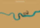
Inspired on the River Thames’ shape, FLOW’s shape takes the shape of Greenwich Peninsula. The letters ‘o’ and ‘w’ also follow the same organic and fluid style.
The market's visual identity has been inspired by the four main values of the Greenwich Peninsula Market:
Fluidity: A place guided by the flow of the water, never standing still.
Makers: A maker attitude, Greenwich is a place of creators. Creativity at its core, the farmers’ market will nurture the creative mind.
Omnipotent: Ruled by the sky and the water, the environment takes on a sense that there are wider powers surrounding it.
Intersection: Where old meets new, Millennium meets maritime history. The farmers’ market will draw parallels between tradition and innovation.